Monday, 27 February 2012

Test Shots


Practical Update

Today I started to make chages to my mock magazine, and started to change the positioning of cirtaini things, to make the magazine more appealing, I intend to make my pictures look as proffesional as possible and make it fit in the magazine better than in my mock.

Teacher Feedback

Teacher Feedback

Peer Evaluation

Friday, 3 February 2012

Mock-up Front Cover

Draft Article

Draft Artical

Test Shots


This mid-shot of Ashley hads a good background, I like the effect of the green crate, but the sunlight glancing on one side of his face makes it difficult to see him, so I wouldn't use this kind of shot.


I like this mid-shot of Adele as she stands out from the background and the lighting works well as you can see her face clearly, and is a clean shot.


This mid-shot of Adele I also like as again, the background makes her stand out.

This is a long shot of Adele, this is good as it is a location shot, I chose this kind of pose and shot as I think it would look good on my double page spread, or contents page, featuring about an article.


This picture is very similar to the one above but I asked Adele to look at the camera this time instead.


This is quite a long, mid-shot of Ashely. But the sun has again effected this picture and has made it difficult to see his face, and the background hasn't worked as well as i thought it would. 


I like this mid-shot of Adele, I like the pose as it just seems simple and about her, and I like how the background has worked to make her stand out.

I Ike this mid-shot of Ashley, the pose makes it look like he is looking and thinking about something. this again could work on my contents page when referring to an article.

This long shot of Adele is good as I like the background, and it could again work on my contents as a reference to article.
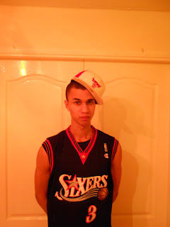
Tuesday, 31 January 2012

Artist Profile

Wes Kirby is the newest urban, British artist to hit the charts, and showing a lot of promise. After his first album was a bit of a non starter for the young boy from Leicester, his new release form his second album 'The Fix' with 'Rock n Roller' has shocked the charts with a high entry reaching no.7 in the first week. Wes's main music interest is the British urban scene, this is what he says 'inspires his rap work in his music' but he also wants to try and aim his music towards the British charts, and so far has done very well.

Monday, 30 January 2012

Font Ideas

The kind of font I am looking for it one that ic a large bold font, but that is clear to see what it says.


I like this style of font, I like that is bold and can still see what is says quite clearly, the concern witht this is though that it is quite chunky, and that this might seem a bit childish and not as mature and stand out the my desired target audience as much.


I like this font as it is very bold and will stand out, however, the style of the writing does not make it very clear to read, so my audiance may not read the name properly or not notice as they can not read it.

I really like this font as it is clear to read and is bold so it will stand out well.

I also really like this one as it is very clear to read, and its quite bold so will stand out, but also looks like a mature style of writing that will apeal to my target audiance.


I like this font as it nice and clear and bold but also looks like a mature style of writing that will apeal to my target audiance

Friday, 20 January 2012

VIBE Magazine- Target Audience Research

Vibe magazine is a magazine that deals with R&B and Hip-Hop music genre and the artists. The magazine has a total audience of around 2.4 million people, 55% of which are male 45% are female. The average age of the readers is 30. 35% of the magazines readers are between the ages of 18 and 24, but then 67% are between the ages of 18 and 34. 29% are over the age of 35.

55% of the readers attend a college. And 62% of those that are not in college are employed. The race of its readers, 75% of them are black/African American, 16% are white, the other 9% are part of other ethnic groups.

Thursday, 19 January 2012

Double Page Spread 1

Magazine Analysis

Wednesday, 18 January 2012

Contents Page 1

Magazine Analysis

Front Cover 1

Magazine Analysis

Tuesday, 17 January 2012

17/01/12 Target

Today I aim to complete my analysis of the front cover and contents page of a magazine.

Sunday, 15 January 2012

Magazine Covers I Like

I like this mgazine because it is a simple design but with a little weirdness to it and the glass design.

I like this cover because I like David Beckham. The use of a star image helps improve the appeal of the magazine. But I would be able to recreate this image with another model, derssed in a suit, aiming to look like a famous person.


I like this magazine because I think Paul Gascoigne, and I think he is a footballing legend.
This magazine stands out to me as it has a unique title and design to it and the design is quite simple design.

I picked this cover as I like the actress on it, and i like the lay out of the magazine and how the different aspects of it stand out.

I chose this because I like the artist on it, and i like the use of these colours and how the use of the t-shirt is used to present a bit of white text.


I chose this cover as i like the use of colour and how the seperate articals are separated and located, I also like the use of the model
I chose this cover as I like the use of the models cover some of the masthead, this shows people will recognise the magazine when they see it, without having to see the whole name.